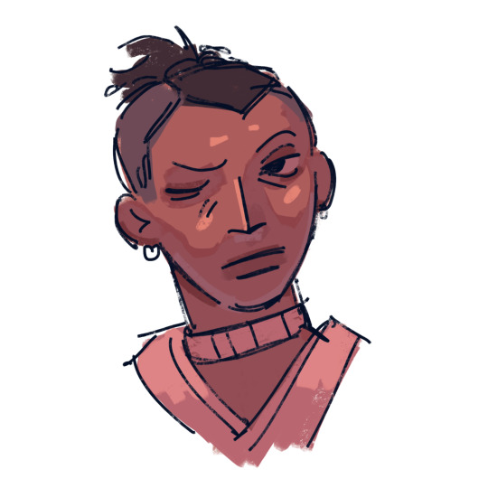
#tried to use a nice and saturated color palette
Explore tagged Tumblr posts
Text
ah. yes. this guy
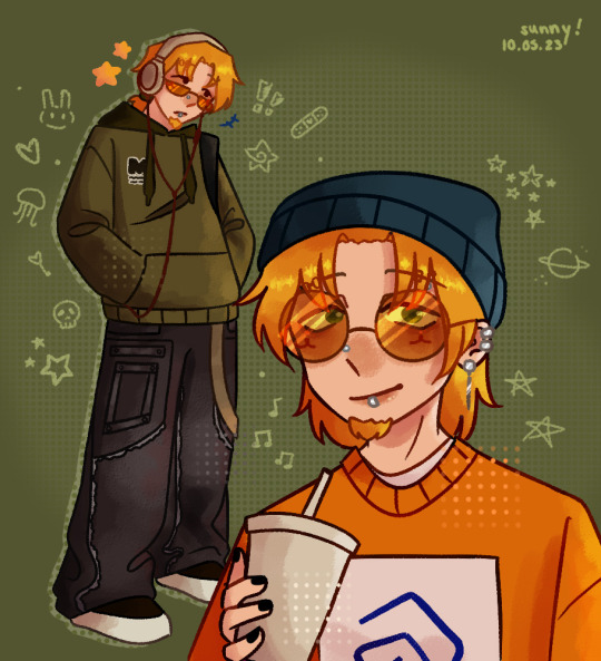
he lives in my mind rent free so i just really had to draw him
(again)
i could spend hours just rambling about how much i love him i'm fuckibg tired
idk the thought of him just wearing cool stuff wouldn't leave my mind and one day i was just sketching things this is the result XP
jake by zarla-s
#sunny's art#vargas#vargas zarla#jake#oh my god i love him SO MUCH#posting it here first because posting here doesn't make me want to rip my hair out#i really want to finish school already so i can draw a lot#i have a bunch of ideas#i don't really know what to write here today i'm disappointed of myself#just that i love him so much#currently kicking my feet while writing this#i really like this one#the black nails looked cool#he needs more screentime !!#i wanted to draw him with a cat beanie but i couldn't draw it for some reason#tried to use a nice and saturated color palette#i also wanted to add a filter but it was way too saturated already#the background sucks#i'm fuckibg falling asleep#i will do a nicer bg tomorrow#edit: i sort of did? it's definitely better than the last one#i love flopping that's why i post here /g
103 notes
·
View notes
Text
RO Updated Look³ (but I'm actually satisfied)
Under the cut for my design and change ramblings + the old design if you wanna compare and see the changes.


Here they are, fully in technicolor. Blasted melanin into Weylyn, Eliseo, and Ophelia, because A) I dislike how washed out they looked in the old design, B) makes them actually look distinct and not muddled, and C) they are literally mixed race and that feels like an injustice to them (yes 'them', because I'm including Weylyn now (his other half is from his mother's side). The color palette for each of them (individually and together) looks better, now that it's less saturated and easier on the eyes since the colors are bit more muted now. The clothes are better now too, and look like something they would all actually wear on a normal day based on their style preference. Plus, noses! All of 'em got distinct nose shapes. I tried to give also their own eyeshapes, but I think I mostly failed at that. And, uh, I guess face shapes? Weylyn's the most noticeable compared to his old design, and I honestly am happy with how he looks now.
Fleur's the only one that changed the least, I swear. She only got a haircut and called it a day. Jasiel too, but I'm already satisfied with how I dressed him, so he's fine the way he is already. Just changed his color palette from the saturated traditonally drawn art of him by muting down his colors and gave him brass bronze colored eyes to differentiate him from his siblings' golden ones.
I'm still really happy about Zephyrine's redesign, makes her the girly I knew she was destined to be. It really makes her stand out more and gives a better impression of her, plus it oomfs her character silhouette which is nice. I'd like to imagine she thrifts her clothes frequently, so there are a few clothes she has that look worn and washed out and clearly refurbished by her. The golden zig-zag on her cardigan is put there by her since she found it plain without a little pizzaz, and the gray beads on the end of her skirt used to form a leaf patter for each pleat, but lost beads overtime, so Zeph just added more beads, not to remake the shape (god forbid her patience runs out before she even manages to make one), but more on mark the skirt as now hers and styled to her preference.
Weylyn and Cooper were eventually dragged in to the redesign, mostly with fixing their hair (especially Cooper's since I didn't like him looking similar to Eliseo's) and clothes. Cooper's fit needed to give him that goofy weirdo vibe I wanted for him, plus actually making him look more friend coded than, uh... whatever I had in mind for his old fit. He's a bit more bejeweled, as more of a subtle telling that this man comes from wealth and is also kinda eccentric. For Weylyn, besides minutely fixing his hair and gave him new clothes, I changed his eye color too to a more yellowy hue than the old gold-ish one. It's not that obvious on mobile, but I swear it is on PC when I was drawing. 😭
Finally, Ophelia and Eliseo. The latter is fully embracing the dark grunge with pierced ears, a bit more silver chains and more rings and all that black clothes. The yellow smiley face is based on the band Nirvana's iconic logo, I just made it drippy and the smile into a toothy one for the troublemaker vibes this dude is going for. I gave him a mullet now (I think it's a mullet yet I also refuse to believe it is), based on some bad boy hair pictures I used as reference from Pinterest. Ophelia, on the other hand, had layers remove, let her wear a grandpa sweater and brown pants instead of her shorts (permanently stained with mud from all the times she went out to the forest to find for beetles), have a little string with beads dangle from her belt line as a treat. Her hands wear fingerless gloves now, and her doc martens are now replaced with regular old sneakers and black socks to hide her scarred ankles. She's droopy eyed now and I think it fits her more now for her personality and story compared to her round eyes. I based that loosely on Anya from Mouthwashing.
I didn't do a uniform line up like last time for the RO's that attend Lumintoile, because that'll be it's own seperate thing alongside an updated uniform look in general for the students. So you'll see everyone (minus Cooper) wearing uniforms with one of three pairs wearing a uniform variant for the different seasons. I also do plan to make an updated relationship chart, to see what's going on now currently between the RO's now that the story has changed and a new contender has arrived.
Older designs for comparison (minus Jasiel bc the man was not a concept at the time of me making this 😭)


#L's scream#L art#Weylyn#Fleur#Zephyrine#Eliseo#Cooper#Ophelia#Jasiel#will update the character appearances when I wake up (it's 6:26 am)#time to eep
15 notes
·
View notes
Note
Hi Jade!
For the Evil Art Style challenge:
When doing traditional art, your style is all sharp points, hard lines, and a 'hatching-style' of shading.
With digital art, you use pencil-like brushes for the thick outlines and smaller, more delicate details. Your colors are very solid with minimal shading and tend to be very cohesive as a palette.
--
I love how genuine your art feels and how passionate you are about creating!!
You inspire me to keep drawing and posting! <3<3<3
-Berry
OHMIGOSH BRO THIS WAS SO NICE I did this traditional one just for you so hopefully it’s beautifully evil (I tried blending the little bit of shading but idk) I’m feeling very UwU today hehehe
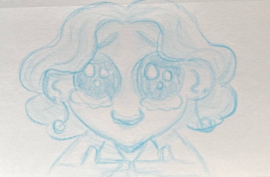
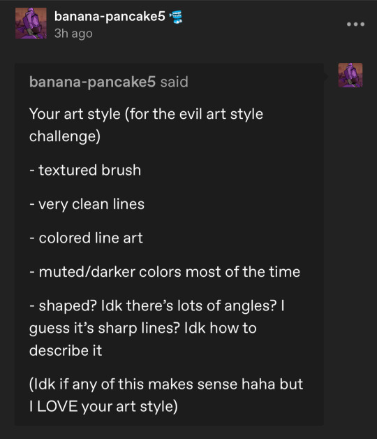
And then for the digital I tried combining the stuff you said and the stuff @banana-pancake5 said and the result make my eyes bleed from the colors 😭 so yeah a little warning for super saturated colors
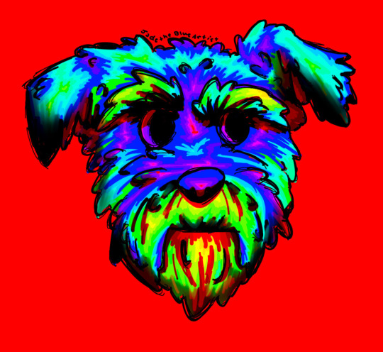
This is my dog and I love him but I’m glad he’s not this bright
This was really fun (and insightful ^^) so thanks for helping me out
14 notes
·
View notes
Note
Hello! I love your use of geometric shapes and saturated colors in your illustrations. Which artists influence your work?
Honestly while I can name a lot of artists who serve as some sort of inspiration for things like creature design or color, I can't really place ones for specifically the geometric aspect! I'm sure there are some out there, but I think a large part of specifically that is probably just me personally liking balanced/clean/symmetric stuff along with most of my sketch papers growing up being gridline paper, so doing sharp geometric shapes was common. I also tend to think of my lineless art as similar to layered paper art, which has to be physically cut out. Its sort of one of the reasons I reuse colors often? Like you'd reuse the same piece of paper
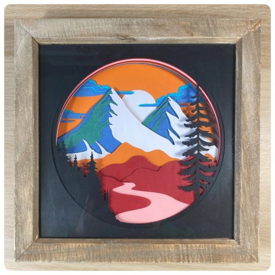
Color wise I pull a lot from my friends, save a lot of art I think does interesting stuff with colors, etc. Generally I might skip through a couple artworks for a good "starter" color or a palette I like and go from there, adjusting it for personal preference. All the parts are drawn in little individual bits, so I can change them all independently. So often I have colors in mind at the beginning, but don't actually pick them till the very end. Here's some pieces to show how that gets fiddled with
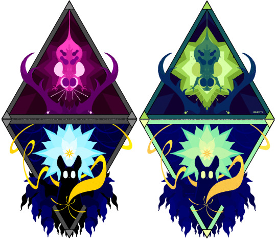
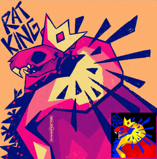

And if you go back far enough, everything starts as a yucky mash of whatever colors made it easiest to tell one piece from another with zero regards to palette
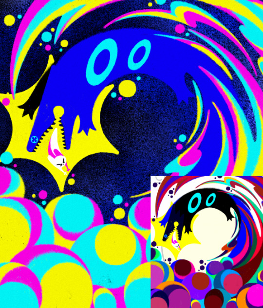
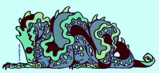
I just really like bright saturated colors and honestly just kinda feel it out from there. Sometimes that's making it brighter sometimes that's making it a little more washed out. Sometimes I decide what I was going for doesn't actually look as nice as I thought. It's sort of hard to name inspirations directly because so much of what I do I do effectively by feeling, and I have piss poor memory so naming exacts is real hard. If I tried to list people whos art I think about a lot we'd be here all day. I know a lot of my recent stuff has had more direct inspo from Boxheadpaint who has just amazing shape language (but almost the exact opposite of 'geometric' but I try and match their vibe a lot when I'm trying to draw a little looser and less stiff. Also looooove how they texture stuff)
37 notes
·
View notes
Note
Just curious what you think about while making label flags, because i have no idea where to start with how i want to represent something in a flag :/
I've started to use colors that simply look nice and that represent less gendered things when I create my flags nowadays.
When I first started, I wanted flag colors to be far more obvious. A lot of my male-related flags used blues and teals, for example. Now I branch out more, seeing teal as something that can represent androgyny or abinarity. This is more of my personal view of colors and what they mean in relation to my own experiences.
Sometimes flag colors can represent concepts rather than genders. When making maverine flags, I don't see orange as representing not-blue (male) and not-pink (female.) Instead, orange is representative of individuality. I might use red to represent personal inner conviction, like a fire burning within someone. If I'm making an abinary flag, I enjoy green, yellow, and teal simply because I vibe with those colors together - teal is definitely MY color and represents the abinary side of my identity. A lot of my xenogender flags use purple and pink to represent galaxies because when I think xenogender, I think of space. I try not to think "Well, purple is usually an androgynous color or a color for nonbinary while pink is usually used for femininity, so I better not use it."
I think starting in a familiar place is a good start. Come up with labels that are related to your gender experience and experiment with colors that you like, colors that feel like they represent you. I've seen all kinds of interesting color preferences from people who request flags from me. They'll ask me to make them, say, a new maverique flag, but they might prefer I use a lot of blue and purple because those colors feel maverique to them. It makes for some very interesting flags.
Experimenting with color combinations is also something I'm recently getting into. Instead of very bright and saturated colors, I've been tinkering with muted colors. Natural colors. Combinations you don't normally see (like with my recent flag redesigns - the maverique and nonbinary flags have an interesting palette I've never tried before.)
My overall advice is to try something you rarely ever see in flags and put your own personal spin on them.
- 💙💚
6 notes
·
View notes
Note
the way you color things makes me want to commit crimes. any coloring tips for a baby digital artist who doesn’t know how to do the computer things good?
AUGH apologies for taking so long, i was in the middle of writing this answer and the whole thing was deleted as soon as i switched to another tab on my phone, and then the draft didn't save the second time i tried to write it. jfc at least i had it written out in my notes app the second time. anyway, thank you thank you thank you!! this was very nice to recieve, i love getting asks ❤️
i'm not versed in the arts of drawing on a computer, either, so i can't give tips in regards to specific programs (said in chronic procreate user voice) but i can certainly give universal advice keep in mind that i'm not professionally taught in the slightest so i lack much of the vocabulary to describe my methods, and remember that my word is not law!
in case of confusion, everything has been explained. i've added a cut because it got needlessly long. i've also added visual guides for certain tips, and image descriptions for each one
to be honest, much of what i do when picking colors is done with the help of gradient maps (more on that later) but when choosing my base colors i follow these rules:
1. you don't have to cell shade with purple + multiply and an add layer. that's the voice of lavendertowne attempting to take control of your body. stamp it out. (/j i love her)
2. bright, vivid colors!
3. instead of shifting just the brightness and saturation when picking colors to shade, shift the hue, too! in the first image, we can see that the circle is dull and boring. in comparison, the second image pops!
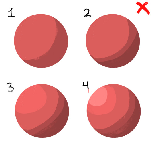
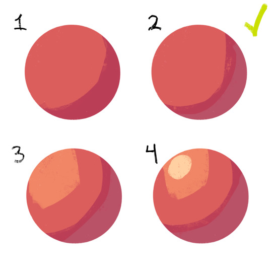
4. so, how does this work?
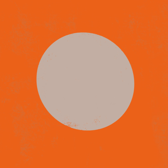
without getting too much into color theory--because while i've studied it before, i don't trust myself to articulate it properly without making a fool of myself--it's all about how colors interact with each other. for example, a beige circle looks lighter when surrounded by a dark background rather than just plain white.
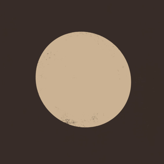
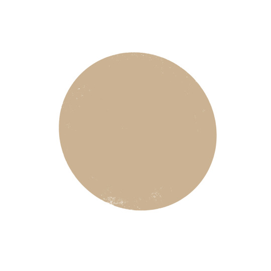
in the same vein, surrounding greys/desaturated colors with warm colors makes them look blue, and vice versa.

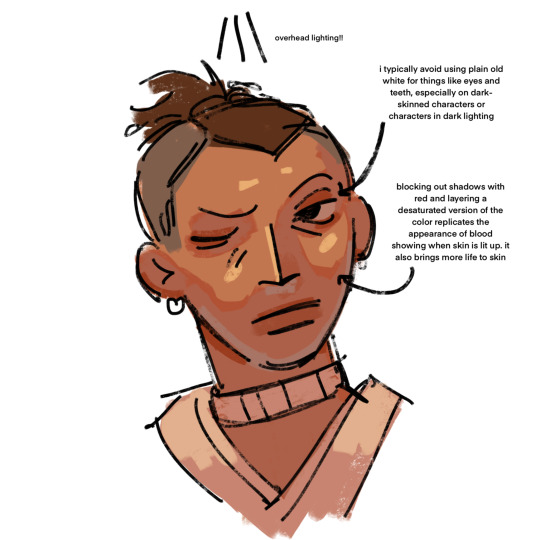
5. blue/grey shadows and warm lighting!! or the other way around. actually, you can use any color for shadows and lighting, depending on your light source. is it sunny outside, or are they beneath white light?
6. for color picking, i reccomend avoiding using the wheel, instead opting for the rgb sliders or the hue saturation brightness sliders if you're dumb like me. this allows for precision in the colors you pick, and accuracy when putting together color palettes.
7. and, finally, the actual computer stuff: gradient maps! i looove gradient maps.
as far as i'm aware, procreate and krita have the gradient map tool. ibispaint does not. i am not sure if firealpaca does.
i usually use gradient maps to make my coloring more cohesive, rather than just slapping them on a monochrome drawing (which is also a totally viable method for coloring, but you'll be less precise, as gmaps only recognize values). when using gradient maps, i prefer to duplicate my completed artwork, lower the opacity of the duplicate on top of it (usually between 25 and 50%, depending on how strong i want the effect to be), and use gradient maps on the duplicate.
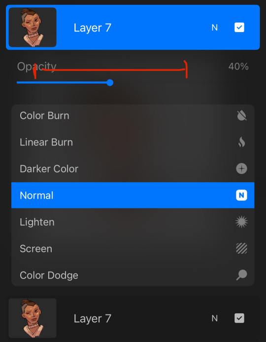
this makes my colors all nice and pretty!
11. if you use krita, it can be hard to find the right colors to use for your gradient maps. never fear! i'm here to give you the default templates from procreate, as well as a couple of the ones i've made.
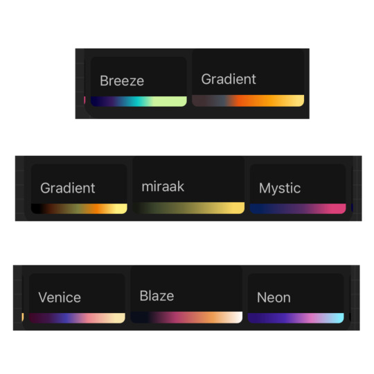
if you have any more questions, or you want me to get further into a specific topic, feel free to send me another ask
13 notes
·
View notes
Text
there are a few shades of makeup that i still would like to get at some point to round out my collection. i am making a post about this to release these desires into the wild so i no longer have them & feel zen. i only have to buy a birthday present or 2 for my sister.
back when i was still getting into makeup, i ended up with a lot of similar colors bc i'd just buy things i thought looked nice & then later comparing them would be like "oh boy another dark burgundy, or dark red, or a dark rose color. who would've ever guessed."


like they're fine colors. i like them for a reason. i do not need any more of these and in fact need to get rid of some. do you live in my area? i have several barely used lip products in these shades that i'd love to give away & can also donate 60% used up nail polishes that are still fine that i just do not use anymore.
i want one nude-ish lipstick but like a slightly purple or grayish one. are those called corpse nudes? the problem is that i'm not sure what any of these will look like unfiltered & swatched on someone who isn't EXTREMELY pale. i follow someone that's super pale that's always singing t he praises of these two specific ones, but i don't think they'll look remotely as good on me.


dramo01 might get me that slightly saturated (in comparison) but still nude-ish color, but it's hard to tell with them. i haven't bought from them before, so i'm not familiar with their formula. i was also interested in diana by unearthly cosmetics but that seems to be out of stock & not for sale on their site right now.


2. i want a sheer black lip balm. i bought one from abomination cosmetics but it's patchy & smells weird. i've tried smoking out a very small layer of two black lipsticks i have (one liquid matte & one more like a mud texture) with varying degrees of success, but it'd be a lot easier if i didn't have to get my hands dirty to blend them. also the mud one has 0 staying power & will end up all over my face if i'm not careful.
also there's a lot of sheer black glosses on the market & that's great but i heard romand is gonna eventually put out a black version of one of their juicy lip tints & i like that formula a lot so that'll be my gloss whenever that drops.
3. i've been trying to find a bubblegum pink lip product like just to have, but they always end up being way too "my lip but better" shade. i have a few too many of these.
4. we're onto eye products now. this should be obvious

5. dramo red shimmer eyeshadow. should also be obvious...though maybe i want a matte instead...? i do need a few more matte base colors....i have a lot of grayish purples & browns from the one expensive palette i bought last year (love it btw) & one rusty redish matte but might be nice to diversify...or i can just use my eyelinerp encils & scribble on that thing. doesn't really matter. i don't have that much eyelid space.

6. i've been hunting for a semi-sheer like yellow-green shimmer eyeshadow, or any like olive green shaded mini palette. i'm hesitant to buy something with more than 4 colors bc i hate the idea of anything going to waste if i don't like it. this palette by shedella is the closest i've foudn to something i like - here it is again in someone's photo, but no swatch photos at all. and i wouldn't use the white or the lime green. tch


i also saw a green quad i thought was alright at ulta a couple months ago, i think from juvia's place, but when i looked it up online it doesn't seem to be on sale anywhere either so fuck me ig. shoulda picked it up then.
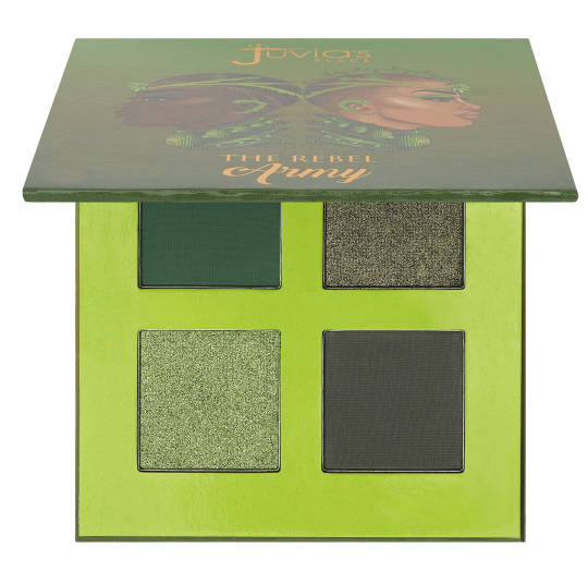
& i have the cheeryep floating life palette (the gray and cool toned one mentioned above & swatched below) and i love it & they also have like a greenish one, but i do not need that many neutral shades. it's expensive. i'm only really interested in these 3 anyway.


but i KNOW i like the brand's quality. it's the best eyeshadow i've ever used. it could be a decent investment.... like might as well have some neutral mattes....especially from a brand i'm already familiar with & know for sure i love. it can't hurt!
except it CAN hurt because it costs $30 not including shipping. and then the little devil goes "well just order dramo01 & the red shimmer eyeshadow too & then put one more thing in so you reach free shipping at $50!" and then now i'm spending 50 dollars. enough!!!!! i will only make ONE makeup purchase per month & i've already done mine for this month!!! i'm also running out of counter space in bathroom for all the makeup i've accumulated over the past 5 years. i need to declutter & then focus on finding another storage solution.
7. i've been interested in pale blue/gray nail polishes with a red/pink shimmer, though this extends to blue with yellow too. i've bookmarked a lot of extremely similar nail polishes. i wish they had photos taken in non direct lighting. i want to see what the base color looks like with nothing else going on.
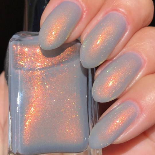
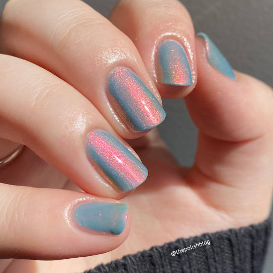
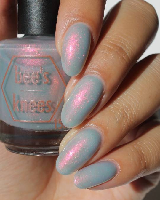


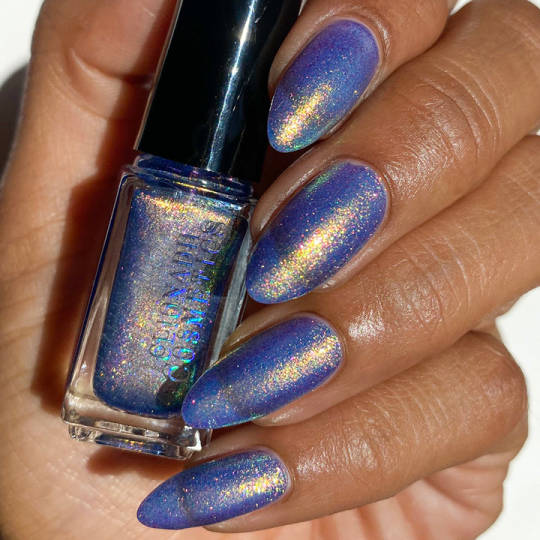
1: shleeepolish bride of fire, cloud my vision by emilydemolly, & praise the dog by bees knees 2: chalk on a sidewalk by death valley nails, cirque colors velvetine, ls#3 from clionadh but that's a set of 3 & i don't want the other 2.
8. had my eye on this one from mooncat for a while ever since i first thought about getting a magnet for magnetic nail polish, but ended up just buying from the same brand that sold the magnet (ILNP) to save on shipping.
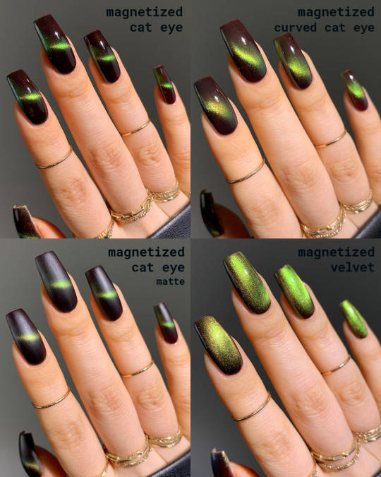
9. ilnp warm amber.
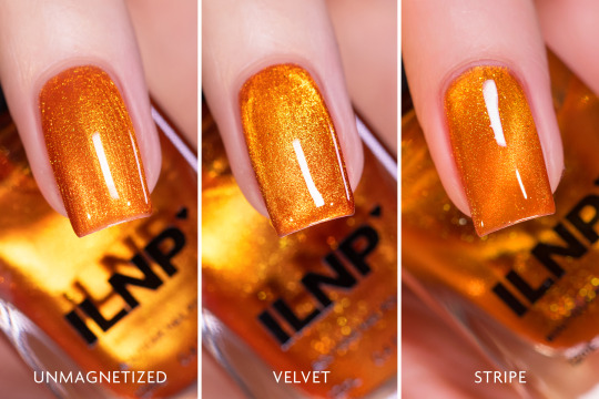
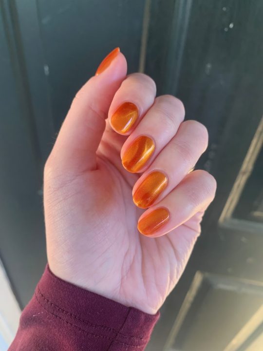
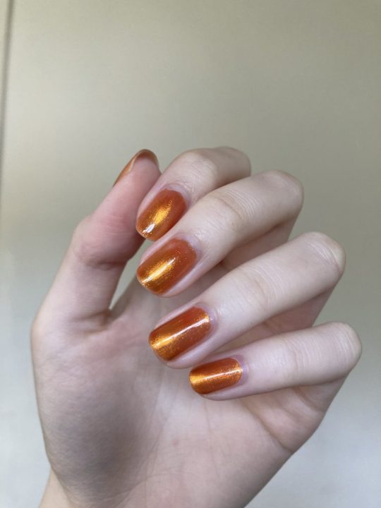
genuinely this is one that's convinced me from the product photos & other people's swatches alone. i don't have a warm color like this & this is gorgeous & looks just like honey.
honorable nail polish desire mentions: a matte red (i had a LIDL brand that was good in one coat for a while but it went bad really quickly), some kind of vibrant & fun summer color since i mostly tend towards darker shades, & a chocolatey/coppery color for fall.
i'm always hesitant to buy new nail polishes though. a lot of the time i steal one from the store when i'm interested in a color & then i just have it there mocking me forever not getting used. there are only a few that i have that i use regularly because i really like them & those are ILNP eclipse, ILNP grand entrance, lights lacquer virgo, essie high voltage vinyl (THANK YOU TO THE MY FOLLOWER THAT SUGGESTED IT TO ME I KNOW AT THE TIME I WAS DOUBTFUL BC THE SWATCHES DIDN'T QUITE LOOK LIKE WHAT I WAS LOOKING FOR BUT I LOVE IT) & sally hansen hypnautical.
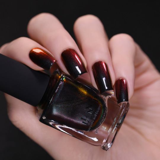
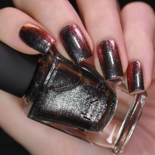

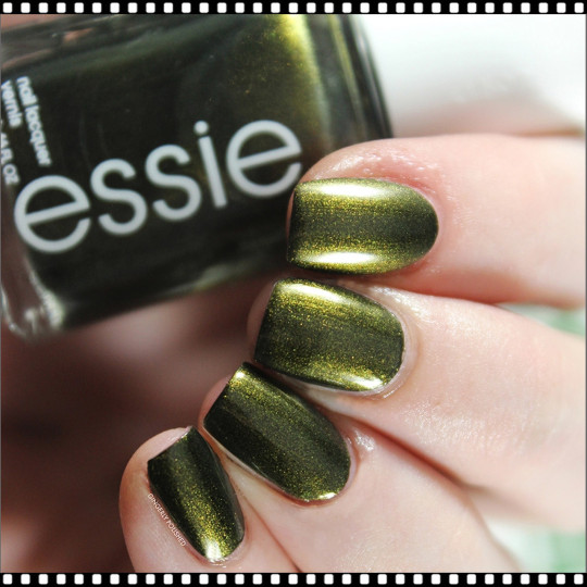
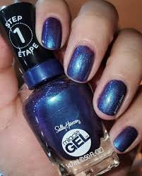
other than these shades, i also have the 2 magnetics i just bought (i like these) & i also have a bunch of drugstore brands that somehow keep showing up. i want to get rid of those.
if i go to my bathroom right now & count the number of things i don't want anymore, it's 17 things. 5 eye products (i learned i don't like the liquid eyeshadows or dip liners), 6 nail polishes (some are probably too old & need trashed but some just don't get used), & a mess of various lip products, half of which have barely been used. i want these things out of here. it'd be nice if they weren't wasted.
i don't really regret buying all these things though. i HAVE been accumulating things over 5 years. it's not like i do crazy hauls all the time - i think i've had like 4 makeup purchases total over $50 EVER. i like most of the things i get & i use them up.
i've learned a lot about my preferences too! lip stains/glazes are my favorite lip product to use because they're lightweight & fairly long lasting. lip muds feel nice on the lips but don't have the best longevity. i don't really like lipsticks like from the tube. or any liquid formula of anything really - i find it too hard to control, whether it's highlighter, eyeshadow, dip liner with brush tip, product where you twist up the liquid formula - absolutely not. i don't like anything "plumping" because my lips are big & beautiful enough already.
anyway yeah that's the main makeup things i've been thinking about purchasingggg yayyy..i also still want to preorder the OFF hat & poster ($70 with shipping) but it's soo EXPENSIVE ... and speaking of expensive i also want this ring but it's $85 & only goes down to $60 when it's on sale. also dont know how big my finger. but this is like way on the backburner ✌ it dont matter

2 notes
·
View notes
Note
2 & 11 for the ask game!
2. Sims writing has a visual component. How do you utilize color/objects and settings in your stories?
This is such a good question! Around the time I started my story, the prevailing aesthetic on royal simblr tended toward saturated, clean, and crisp. I really like that style, but I've somehow never been able to recreate it! One of my longest-standing principles is that if you can't make something match, you shouldn't even try -- you should do something very clearly and intentionally different. I couldn't match other people's stories, so I tried for a wholly different color palette and visual style. I think I've said it before, but one of my big aesthetic influences was my grandparents' house, and they had wallpaper in every room. I'm always replicating their house in one way or another, drawn to the same colors and textures and patterns.
11. What are some elements you think are becoming cliché in the genre you’re writing?
This is less true than it used to be, but historically, royal simblr has tended toward uniformity. When I first started my blog (almost 4.5 years ago now 😱) a lot of royal stories were drawn from the same small reference pools. I love and loved a lot of those stories (they were what inspired me to start a royal story of my own!) but the current era of royal simblr is a lot more unique and eclectic! It's so nice to see people whose stories are clear passion projects, informed by their unique tastes and interests.
Simblr story process asks -> accepting!
2 notes
·
View notes
Text

Made some little sprites for funsies
Color palette ramblings beneath the cut
Using the same palette I made before, but I did have to add one lighter shade of blue because I really couldn’t stand Cap with darker blues. I also adjusted the darkest blue to make it less saturated.
I’m really particular about colors tho lol. Another shade of blue is fine, but I couldn’t stand trying to add any more greens, purples, or reds for Momo or Bolts. Who knows how that works. Prolly cuz I focus my palette range on having a good yellow/orange/magenta gradient and nice blues. I can only have one (1) green for accent or else I throw up and die.
I did experiment with adding a more “pink” shade of light pink, but it was too similar in value to the salmon color so I didn’t like it. I tried implementing the hot pink on either Momo or Bolts, and it just didn’t turn out nicely. Oh well. Even as shading, the hot pink was too strong for Momo’s hair 😔
7 notes
·
View notes
Text
My Concepts For A TMNT 2012 Themed Makeup Collection
First off: Individual small eyeshadow palettes for each character. And I mean small, like, probably just 3 or 4 shades each.
So like, one shade the same color as their masks, one the color of their eye colors, and one the shade of green their skintone is. And I don't mean "Eh purple but like any shade of purple" I mean EXACT SHADE MATCH. So that gives us these nice little trio palettes, I would have them all be All Matte No Shimmers/Glitters, because...
Companion Palatte: Out The Sewers Like Lazer Beams
This is a larger palette, probably around 15 shades, 18 at the very most. It's made of colors taken from scene backgrounds, enemies color schemes, and other characters. Like a more saturated pinky-purple than Donnie's is named "Irmabot Highlights" and a neon pink named "Kick Some Kraang" and such. Obviously some dark navy blues and such to represent the common background color.
Other Companion Palette: Lean Green Ninja Team
This one is 15-18 shades as well and is based around the non-turtle main/ally characters. "Hajime" being a brown shade taken from Splinter's coat, for example, "Hey There Red" being a shade of orange like April's hair with a yellow shimmer to it like her shirt, "GOONGALA" being a high-inpact shimmer with a gunmetal gray base and lots of white shimmer (not just to match with his color scheme but also like, He Hits People Hard Enough To Make Them See TV Static As They Go Down). Things like that. This is a slightly more neutral based palette so it also includes like, the color of their shells and wrappings and such (we could also put these into the 4 palettes based on The Boys specifically, I just wanted to keep those as small and no-repeat-shades as possible).
Turtle Power Cream Color Corrector Palette/Wheel In A Shell Shape
Dude their colors are LITERALLY perfect for color correction. Orange/peachy tones cancel out blue tones like undereye darkness/dark spots left by bad breakouts, purple/lavender tones help brighten, green cancels out redness in the skin like angry breakouts or rosacea, blue is less of a color corrector though and more of a Shade Adjuster however including it means you could still mix it with a foundation that's too Warm to cool down the shade, just might work best with a cream foundation father than a liquid since you need to mix it in directly, not just apply product over it.
Anyway.
MAN I LOVE BEING A TURTLE! Blush
Same shade as those little amine-style blushy bits they get on their faces, and kind of that pattern? Like the little shape/style it is, in the actual pan. I just think it's be cute.
Makeup Tools Shaped Like Their Weapons
Brush with a Bo style handle and the actual bristles are gray and angled like the blade at the end. One of those things people use to block their crease from getting eyeshadow fallout shaped like Mikey's bladed part (I tried looking up the name but there were a few variations of that and I wasn't sure which was right), angled eyeliner/brow brush like Leo's blades, eyeliner pens shaped like Raph's Sai, and I'm thinking an actual hand fan that looks like April's tessan to help dry the face is you use setting spray during makeup.
I've been trying to come up with fun lipsticks but I can't think of anything rn I'll update later though if I come up with anything.
21 notes
·
View notes
Note
How do you draw so good and how do I achieve it?
First of all, AAAAAAA thank you so much, this is so nice of you to say :, )
I always appreciate your nice comments on my work - and your art is great too. I love how quick you are with it, and how much you enjoy the process (you said you love coloring, and I admire that because I very much speed through it like "god, let me get this over with PLEASE" ahah). I also love just how much your style is squishy and fun, and you have a good sense of anatomy!
Secondly, I don't consider myself "so good" - but I can just let you know how I got here! I... just did what you're doing right now, which is draw a lot, and draw things I like to. And eventually, I got here where I still do that but at a bit of a higher level. Its like... by challenging myself through ideas that I wanted to do but didn't think I could (which forced me to look up things and use reference aids), and eventually I learned the ropes of new things very slowly.
I will be honest though I had help with my coloring style, I studied some artists that I liked and tried to get their color palettes down because coloring and lighting does not come natural to me. I tend to like warmer and saturated tones! So I went with that!
I hope that helps in some capacity :,]!!!!!!!!!!!!! you're doing great with this already!!! :D and once again thanks for this, it's very sweet of you
#my asks#asks#wahhh sobs sobsosbosbosbsobsobsbsobs#i cry whenever people talk about my art style#its hard for me to conceive what my art looks like outside of me seeing it#so thank you!#and i admire your art !#: D
5 notes
·
View notes
Text
More thoughts on Persona 3 Reload below. This is gonna be a long one.
I'm gonna start with the gameplay because everything I know about game design comes from watching videos. So I am a dilettante at best, and my opinions pretty much come down to "did it feel good to play?" And God, did this game feel good to play. I've seen some criticisms about the shift mechanic and how it trivializes difficulty, and the capacity for very high damage even on the highest difficulty. I played on normal, so I can't speak on that, but this comes down my fundamental philosophy on difficulty in games. To grossly oversimplify, games rely on mechanics and story to keep players engaged. Difficulty falls under mechanics here, and great games will use both to give players a good time. But you can sacrifice one if you make up for another. Some visual novels and almost no gameplay, and almost no one is playing Mario for the story, to give two extremes. As such, I think Persona 3 is more than engaging enough on a story and characterization front to make up for a rather easy time.
I think the boss fights are where the combat suffers, because I don't feel any inclination to use interesting strategies. It's just buff, debuff, and attack. The one time I used an interesting strategy was after I died to the Hermit, and decided to switch up my team, bringing Shinji, Ken, and Aigis. I kept Aigis' weakness safe with Makarakarn, buffed with her and MC, and then just let loose. Every time I tried using a status, it would be blocked (which also made Mitsuru feel limited in her usefulness, since that's her Theurgy characteristic), so I just stopped trying. I find it weird that resistances to status effects aren't included in Fuuka's scans. Also, the Monad Corridors provide opportunities for interesting strategies, but unless you want to die once to scout or consult a guide, it's really unlikely that such strategies will work. All that said though, I think the combat and gameplay was engaging enough. It just relied on being a power-fantasy often, between chaining 1-Mores and Theurgy skills. And even then, I did have tense moments while traversing Tartarus, so it's not like difficulty was completely absent.
All in all, though, the game was immensely fun, and holy crap, everything felt so satisfying to navigate. Menuing was instant and load times were practically non-existent. I can attribute some of that to playing on PC (mine has decent hardware), but even older games aren't as instantly responsive as this one was. This leads me into design. Every aspect of this games design is gorgeous and cool as hell to me. I've seen a lot of praise for it already, and with Metaphor on the way from Atlus, it seems they've picked up after P5 that people love stylish menus and want to continue that. That said, I do have incredibly slight reservations about it, precisely because P5 did it first. Everything being off-kilter fits with the game being about rebels, and P3 doesn't share that identity. However, asymmetric design doesn't have to be restricted to only being a thematic reinforcement; it can also just look cool because. I actually think P3R does a good job of retaining the look of OG P3. It had pretty standard, inoffensive menus, and it's primary way of making it look cool was through the color palette. P3R manages to retain the streamlined blockiness of the original while introducing asymmetric elements in a nice balance. For instance, compare how the date looks in Persona 5 as compared to P3R. I won't harp on it too much longer, because I could pick a ton of details to focus on (I will bring up the Theurgy menu though. So cool). The game is also just overall gorgeous. The models, sprites, animations, effects, everything is great. It's notably more saturated than the original, which I thought was an interesting decision, but ultimately it doesn't affect me either way. I think it suits the overall art direction, but had it been different then a desaturated palette would've worked fine.
The voice acting is great and I think suits each of the characters very well. Since I played a bit of P3P, it took some getting used to Yukari and Junpei's voices (since I was used to Michelle Ruff and Vic Mignogna). I've gone back and listened to some of the original dialogue and I frankly think some of the voice acting from back then was bad. Fuuka and Aigis especially sound very awkward. That was intentional for Aigis, but even then, it sounded to me like someone doing a robot voice poorly, and I can't quite place what's off about it to me. In any case, I think her new voice is a marked improvement, and I like that she still manages to make her sound like a robot because, while she has no problem with inflection anymore, she always speaks quietly and extremely evenly. It's the evenness of her speech that gives the robot vibe this time around, I feel. Also, Ken actually sounds like a kid, which I appreciate. As someone who wasn't really familiar with the original cast, I think they nailed the casting this time, no character's voice felt off.
Speaking of the cast, though, I love the characters so much, every one of them, in the main cast, at least. I enjoyed a great deal of the social links as well. Ignoring the ones with party members for now, I think my favorites were the ones with Maiko, Hayase, and Akinari. Although I'm looking over the list now to refresh my memory, and it's really hard to pick favorites on this. Akinari's is peak, of course. I think I went into it with too high of expectations, because my friend told me if I did any, I had to do his and that it's the best in the game. Ignoring those with party members, I agree that it's the best, but my expectations were placed too high. In any case, it's an incredibly touching story with an excellent message. I didn't end up doing Yuko's, Hiraga's, or Bebe's all the way through, but I almost finished Yuko's and got a few ranks in to the others. As for the main cast, I could be here forever if I got into every character. This post has gotten long enough as is so I think I'll make a separate one giving my thoughts on each member of SEES, Strega, and Ryoji. I think I'll also discuss the plot and themes in that post as well, or I might separate it again.
1 note
·
View note
Text
Some Thoughts About... Popful Mail
Some Thoughts About... Popful Mail (PC-88 EGG Console re-release, 2024)
Popful Mail is one of my top 5 favorite games so I was very excited to see it come to the Switch. Very quickly tampered by it being the PC-Engine version, not the Sega CD one. Or even that SNES version. Or even the PC-98 version... But still! A chance to play Popful Mail again! It was one of the first games I got for my Sega CD and I love it to this day. I mean, if you look at Lust or my other demon characters and wonder why they have such long ears, it’s a healthy mix of Popful Mail and Shining Force/Yoshitaka Tamaki’s art.
Just to reiterate! This is the PC-88 release. It is not the (fantastic) Sega CD one. The game is in Japanese. Just about everything. Popful Mail isn’t the most story-based of games, but you’re going to miss out on all the dialogue. And the menus. And the stores. An overlay explaining the shops would be nice or just stick a translated picture in the instructions. I remembered enough of the Sega CD one to find the heal option and buying items at least shows a picture of what you’re buying, but some of the options don’t make sense to me. There’s a PC-Engine 98 walkthrough on GameFAQs and that was most useful, but there are enough differences between the 98 and 88 versions that it’s not perfect.
There’s a point where you have to “swap disks” to continue and for some reason that’s not automated in the overlay and the message is in Japanese. So you go to the disk change menu in the EGG overlay and there are way more options than you think there would be. There’s a “2” in the Japanese message so you try switching to disk 2 and nothing happens. So it’s just trial and error swapping thing around. If you swap disks in both drives and load the visual disk, the game progresses! BUUUT! After the cutscene, the game just goes black with no message, English or Japanese. I tried every combination of disks but couldn’t get it to progress. So I reloaded my previous save and ignored the “2” in the message and only swapped to the visual disc, and then after the cutscene, NOW swapped it to the “2”disc, and it worked! There is absolutely no reason this should not be automated or be in the EGG instruction manual. This was just a straight up garbage process. I could understand leaving it how it is for history’s sake, but to not have a translated step-by-step guide in the EGG instruction manual is just laziness, incompetence, or being so cheap that you won’t spring for an extra three sentences of translation work.
It’s still an action-adventure game but it used a bump combat system. So weird! Instead of slashing a sword, fighting is just jumping over enemies and hitting them from behind. Attacking from the front either has the enemy block the attack, do damage to you as well, or shoot you with a projectile. Just smashing into them from the back makes some of the early bosses easier than regular enemies with projectile attacks. The bump system actually makes Mail terrible for the majority of the game. In the Sega CD version, I used Mail for all but a few fights. In this version, Tatto is the star of the show where you’ll spend stages in a row never switching off of him because of how much enemies spam projectiles or how most bosses fight you from a distance.
Lining up shots from the back is made more difficult by the how limited the color palette is. The graphics are hard on the eyes. The backgrounds are super busy and just as saturated as the main characters while being the same colors, plus it kind of blurs when you walk. So yeah, it’s a rough play and I stuck to very short play sessions.
The music is still awesome. It’s similar to the Sega CD’s but just different enough to be fun in its own right.
The changes the Sega CD version made are interesting. In this version, Mail can toss daggers up and down! The wedding ring sidequest is gone so you never fight the leader of the Badger Gang, but that same lady now leads you to freeing Slicky from the cave-in. Muttonhead has an evil Gaw! Your health refills when on the world map! You’re not allowed to change characters during boss fights! The boomerang is governed by a mechanic where you have to hold the attack button down to send it and it returns when you let go (making it almost useless). The economy balancing is... well, it’s actually pretty close to how Working Designs re-did the Sega CD version. Everything is crazy expensive and you die in just a few hits so the game is super grindy and unfair.
In short, if this was the first/only version of Popful Mail I ever played, I wouldn’t have any reverence for the series. This game is just frustrating, grindy, and the fetch quests are tedious even if you can understand the language. This is a neat historical piece but it is not a fun game to play.
To be honest, I couldn’t force myself to finish the game. I got up to the boss of the ice world (world 4 of 5) and it’s one of the most poorly made fights I have ever played in a video game. The boss’s attacks move too fast for how bad the controls are and how small the gameplay window is and each attack drains your health so you die in a few hits. It took me multiple deaths to even realize why one attack was almost instantly killing me even when I dodged it (it leaves a like 3 pixel tall trail behind the shot that is blue on a blue background on top of blue ground). The boss spends most of the fight invulnerable and only opens up for like two seconds, which is barely enough time to hit it and can line up with the other shots it’s firing so you lose half your health to take off two percent of the boss’s health. And to top all that off, you’re dealing with ice physics while trying to fight it. It’s not a hard fight; it’s a poorly made unfair fight that has no redeeming factors or entertainment. In the Sega CD version, this fight is a slog, but it’s entirely doable and certainly doesn’t feel unfair. It’s simply not worth beating that boss to see the end of the game. The EGG Console overlay has a weird “scene select” option that lets you jump to specific points in the game and one of them is right after the ice world, so I gave the last world a try, but the bosses remain absolute trash. I forced myself to beat the Golem boss in 5-1, but once I got to the Fright Knight in 5-2, I just put the game down again and gave up. The boss itself isn’t difficult, it’s that the boss is designed to take advantage of the worst part of the controls and camera so you’re fighting the game rather than the enemy. And, yet again, the boss has an insane amount of health, kills you three hits, and spends most of the fight invincible. I had to look up online how to even hurt the boss. So thanks, Youtube, and for showing me the end of the PC-E version of Popful Mail. At least in the PC-98 version, Mail’s fight against the Overlord actually looks more interesting than the Sega CD’s, but I’m bummed out I never got to experience it.
Whatever EGG’s porting overlay is, it has an option to speed up or slow down how the game runs, so that’s neat. It has a rewind feature, but instead of it being the normal “hold down to rewind”, pressing the button jumps you back a little bit, so you have to keep pressing it until you get where you want to be. But it doesn’t seem to jump you back the same distance each time you press the button. There’s no precision to it, but it kind of gets you there as long as you’re willing to go way farther back than you intended.
The rerelease includes a gallery with some fun art I hadn’t seen before. Buuut they didn’t translate the text or notes so it feels super low effort.
The game is only $7, so it’s hard to gripe about some missing features, no matter how basic/needed they may seem (outside of that disc swap menu translation), but man this is just a lousy version of a great game. The PC-98 version looks bad but still a lot better than this one, so why wasn’t that one ported instead? Maybe the EGG engine only does PC-88 games? I dunno. Maybe interest in this version is enough to push Sega/Falcom to just pay for a new translation and VO for the Sega CD version so people can play the best version of a great game. The Sega Genesis Mini 2 had Popful Mail, but only in Japan, so the English-speaking world is really missing out. And now I’m mad again that Shining Force CD is also trapped on the Mini 2 instead of also releasing it as a stand-alone game!
0 notes
Text
So, I finished Splatoon 3 Side Order. I did EVERYTHING possible on it. I collected all the color chips, I completed all the palettes, I bought all the things I could get from there and... I feel less than satisfied? That doesn't sound right, I was looking forward to it! Why do I feel this way?
So, in this post, I'm going to try and articulate my grey-and-gray feelings about a DLC about grayscaling and color into a silly little blog post online and see if I'm not alone in feeling that way.
You've already read the teal deer by the way, I'm not putting one under the read more. Oh, and major spoiler warning about literally everything in Side Order. I'd recommend having cleared at least one successful run before you even THINK about reading on.
So, let's get the good bits out of the way first, the story? Sure, it's very bare on the surface but the buildup to Marina Agitando and, subsequently, Order itself in about four runs (one successful tutorial run, two failed runs, one successful normal run) was great. The characters, as usual, were great, it was nice to see Acht in the flesh and it was nice to catch up with Pearl and Marina, the only lesbian couple in Splatoon and I say this in the most affectionate manner possible because I find it hilarious how Nintendo decided to just lean into it.
The memes aren't lying, this really is a DLC about a lesbian couple in an elevator hanging out with their mute possibly-enby friend who had a tussle with Agent 3 once upon a time and an enby DJ who chills in the elevator because they had an injury in the matrix.
The stakes aren't quite as high as, say, the annhilation of all inkfish kind like Octo Expansion and Rise of the Mammalians, the stakes here are that Order wants to grayscale everything and force everyone to live in a world where nothing changes because they feel like that's what everyone wants. At least, that's what Marina initially wanted until pesky Eight and Pearl came along and RUINED IT.
On the surface, the gameplay seems cool too. You pick out a color chip per floor that augments your weapon and you really can make the most batshit insane builds you can think of. Want a splattershot that pours out ink at insane speeds like an aerospray with none of the downsides? With the right chips, you can! Want to make a Grizzco Blaster but better in every single way? There's chips for that too. Want to pretend to be a TF2 bot and snipe everything out of existence? There's chips for your Charger that will absolutely let you do that.
The music is, as it should be, pretty great, even if the DLC as a whole is half-baked and flat in some places (we'll get to that in a bit, I'm not done praising the DLC yet), ranging from the music that plays on each floor to the boss themes to the final boss itself, it's so good!
So why do I feel empty inside? Is it because of the roguelite gameplay? No, I've had plenty of fun with roguelites and roguelikes, I literally have fun playing Gunfire Reborn and hell, I even give Baldi's Basics Plus a fair shake and that game's not even done yet! Go Mecha Ball is fun, Whisker Squadron Survivor is also fun (although right now it feels awful with the elite bosses...), RoboQuest, Barony, hell if you want to stretch, there's Lethal Company. Sure, I don't have as much patience for the genre as I used to these days but that doesn't mean they don't bring me joy. So what is it?
Well... for starters, while the story mode is great, clearing it fairly quickly made it all feel jarring. Again, I wasn't expecting it to be as grand as Octo Expansion but it definitely felt way less impactful. You get to the top and face off against Order who tries everything to resist your attempts to stop it only to then pull out a trap card and start pulling everyone into the Memverse, then your vibe wakes you, Pearl, Marina, and Acht back up and you collect the saturated color chips that it was holding captive and blast it with, you guessed it, a Killer Wail but with COLORS. And then it turns into a small widdle octopus thing and it starts having a widdle tantwum and you go to the real world and that's it.
All the build-up for the climax of the story happens in that one floor and is immediately let go. Okay, fine, I'll take dealing with Smollusk for the next dozen attempts up the tower, especially since it seems like it's developing a personality everytime you go up there going from a stuck-up order fanatic to someone who just wants to have fun... but nothing ever changes.
For every unique palette up to and including Eight's, which has the gimmick of restricting chip slots based on how many hacks you have active, you only get some new dialogue after floor 29 and a new cutscene before the exact same boss, no new patterns and only one new song. Nothing changes about Overlorder besides the subtitle and it dies the exact same way, breaking the portals to break its barrier to then break it down, do this two more times and you win. There's no variance to this.
Speaking of variety, it starts to set in VERY quickly that there isn't as much variety as you'd actually think. Okay, well, it's fine having a roguelite with setpiece levels, Go Mecha Ball, for instance, tends to have the samey feel to the levels but it felt fun to woosh through. But here? You go in, do the objective, get out. The length of time you spend in there is heavily dependent on your weapon, chip loadout, and enemy spawns. Level layouts are varied for the first few runs, everything is new and fresh but quickly wear out after a while, having only two or three variants for each (and there's some that I'm sure only have the one!).
And the objectives are straightforward but it feels like they don't do too much to spice it up. There's a few levels where they actually try to do it such as the one portal level where you can stand back, splat the top spinners that come your way, and then yeeting it at the portals to break them, or the infinity-ball level where you yeet it into a ramp and hope you get a hole in one or another infinity-ball level where you literally are Sisyphus! Or a Splat Zones one where you have a Sisyphusean task of painting the other zone because the sprinkling enemies made it over and just took over said zone and now you splatted them and now there's more back on the other side and ARGH.
However, it does make the more generic levels feel more... well... generic. The only saving grace is that they usually are built around not being around for too long but it does make a run blur together after a while.
And on top of variety, wanna talk about how there's only three unique bosses? Outside of Marina Agitando, who only appears in the ten floor tutorial, and Overlorder? Sure, they're all unique in their own ways and certainly something I haven't exactly seen in either S1/S2/S3 campaigns and OE, Parallel Canon is the most interesting one since they draw from your pallette and can screw you over with your own build if you let them.
But there's only three bosses and you only fight two plus Overlorder per run. I would've liked to see at least a few more, hell, get Octostomp in here, everybody loves Octostomp, right?
Okay, finally, how about the rewards? Well, you get gear to wear, that's great, you get weapon replicas (Order Brella makes me upset because Side Order Brella has Sprinkler/Ink Storm and the replica carries Sprinkler/Triple Inkstrike), you get locker decorations, you get stickers and banners and badges, oh my. Very good! I like this, I like having more options to express myself and I like more weapons because that's one more weapon I can use to farm for silver Sheldon Tickets (I know they're Weapon Licenses but whatever...).
So, surely there's something really cool for the completionists out there? Surely there's something on the same level as Inner Agent 3, perhaps the most hype (and only) superboss in the Splatoon serie? Surely there's something cool for clearing all the palettes, including Eight's? Is there anything for doing that?
You get... one more piece of altered dialogue with Smollusk and an Octoshot.
That's it. That's all you get.
For suffering through nine weapons worth of palettes and then agonizing over one more that boasts a tougher restriction of chip slots being restricted based on your number of active hacks, that is what you get? No superboss, no change in the final boss, nothing, just the same routine like you've been doing the past eight palettes...
I'm sorry but am I wrong for expecting something more? Am I wrong for expecting something really cool? Am I wrong for expecting Side Order to deliver a satisfying finale after having effectively hamstringing the quality of the seasonal updates for a good portion of Splatoon 3's active service life?
Okay... maybe something will unlock after I buy everything from Cypher right? Right?
Nope.
Sheldrone 2.0.
Literally fucking Sheldrone but you use 100 Prlz instead of 999 Power Eggs. And it pulls from a prize pool made up of, I'd wager, tickets, coins, and items from the shop since you could only buy one of each from it.
And the Chip Collection grants you more badges, cool. But there's nothing for reaching 100%, there's no grand fight with another Agent 3, there's no alterations, no extra modes, no dialogue acknowledging your feat, nothing.
It's depressing. It's upsetting spending a year and some change waiting for a DLC and being wowed by it within the first few hours only to peel it back and find that the shiny silver that adorns it is more or less tin foil with a few traces of actual silver here and there.
I want to like this DLC, I really do. But I can't bring myself to fully commit to liking it...
The whole DLC feels half-baked and it's depressing to see it like this. Once the hype simmers down, all that you're left with is an empty room with a bunch of confetti that you now have to clean up.
However, there are silver linings to this DLC, the characters, as I've said, were great and while they have less proper interactions that I would've liked, it's nice to catch up with Off the Hook again, it's nice learning a tiny bit about Acht's past life and it's nice to see Marina's efforts to fixing the sanitized Octolings left in the Deep Sea Metro.
The music, as it does, is full of bangers from start to finish. The Acid Hues and Ebb and Flow mixes were, of course, amazing and the finale to the story felt great.
The setting was also pretty interesting, albeit underutilized. And the reward of being able to go to Inkopolis Square, thereby finishing the trifecta of hub worlds, and seeing how it changed from Splatoon 2 was a sight to behold!
Again, Side Order is not a perfect DLC, it's just an okay DLC that has a lot to be desired. People can have fun with it but I'm not going to ignore the glaring flaws because I felt like it could do SO MUCH better.
1 note
·
View note
Note
I hope you don't mind I weight in, I saw the drama at a latine encanto group. Of course I can't speak for all of us, but latines are (usually) mixed af, our families look like the Madrigales, we are used to seeing all skin shades under all lights and us changing "shade". Under a blue/night light my sister goes from light brown to looking really white, and I go from brown to a pale less saturated brown, some lights even make me really white looking. That what is maybe is causing the disconnect in our sides in how we see the issue, for us skin color changing is everyday stuff meanwhile the values is kept it's okay (Pepa being the lightest, Felix y Antonio the darkest, brownish, (and/or pinkish, bluish, etc depending of the palette) hues for almost everyone else). And I hope my wording does not fail me here but please remember latines are white too, our family lines have been mixed for some of us for more than 400 years, most of the our soft(? curly hair comes from the Arab influence in the Spaniards and then the Arab immigration to LATAM. Thanks for trying to help our representation but we usually find more important that our ethnic features are represented than if the skin color looks different (lighter or darker) because a palette. I just wanted to explain how the other side of the fandom saw this (albeit the user from tw was being really rude instead to trying to explain), I hope it didn't come of as rude, it was never my intention. Have a nice day!
Hello! This definitely isn't rude at all, and I apreciate you taking the time to type out and explain this to me! Also, may I ask if Latines is the preferred neutral term? I've heard mixed feelings on people regarding the term Latinx
This is a very thoughtful explanation, and really has helped me understand a little better on why everyone was so pissed off.
However, I know that no matter what, the damage is done and my intentions or the context of the post doesn't really matter anymore. That's just how the internet works lol. I've already tried defending myself but I can't change the minds of ppl who don't want to change their minds about me, so I'll just leave them to it.
Loke im noticing that the more I try and explain my side, the deeper a hole I'm probably digging? so I may as well take the advice and shut up about it, and save my breath 🙃
#i seriously dont mind at all and really love this ask because it does help explain how different lighting can make other colors change#and idk maybe I will try and expiriment with lighting in my own art now!#but like i said the damage is already done and a bunch of peoole now think im an sjw who wanted to be a white savior and harassed a poor#a poor japanese artist until they deleted the tweet#when in reality i wasnt even thinking about how i could help the latines community moreso I was thinking about how much of a dick#the guy was when the picture clearly was way lighter than pretty much any scene in the movie#but like i said! not my problem anymore
40 notes
·
View notes
Text
Tu... torial? Pt. 3
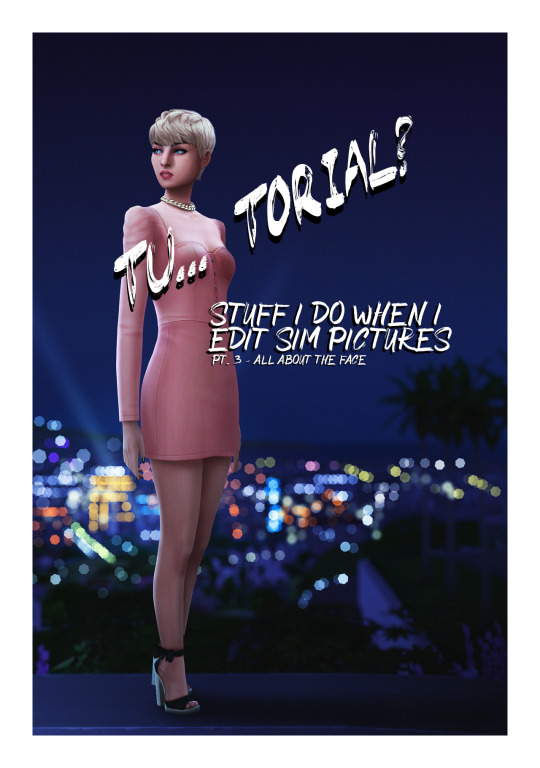
Welcome back to part 3 of my tutorial for anon. In this I will go over perhaps my favourite part - the face. Did you used doodle eyes in your notebook when you were in school? This has the same energy.
This is where things get a little harder to explain because it involves a lot of drawing. I hope you get the general idea though.
Open this in dashboard for best view of the screenshots.
Disclaimer: I have no formal training for any kind of graphics stuff, I work in an office as a receptionist - I serve coffee for a living. I am absolutely self taught and while I consider myself pretty comfortable with photoshop, that doesn’t mean that there isn’t about a gazillion of other things that can be done that I have no idea about. There are people far superior than me in the Sims community. This is just how I do it, with techniques I have picked up through the years. Some things I go over in these will be pretty basic, some things a little more unorthodox. Disclaimer 2: My edits take time. This is what I do to relax, one edit takes several hours for me. Sometimes days :))) Disclaimer 3: My photoshop is in Swedish, which is my first language. I tried my best to find the English translations for every step that I do.
Tools used: The Sims 4, Adobe Photoshop 2020, One by Wacom Pen Tablet (very basic and unfancy).
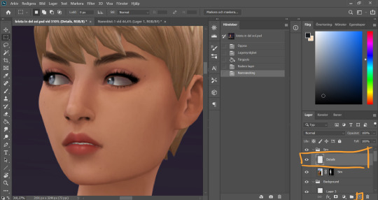
I start by adding a new empty layer in my Sim layer group, above my base Sim layer.
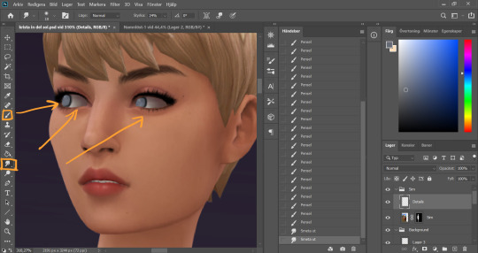
I use the smudge tool (I always keep my smudge tool on Strength around 30%) on the Sim layer to smudge and soften the eye whites a bit. I only redraw my sim's eyes if I'm changing the direction that they´re lookin, otherwise I just refine the existing eyes. In this case I didn't want her eyes quite as far left as they were. On my Details layer, I use the brush tool, hard small brush with opacity around 70-80%, and start drawing the eyes a little bit further to the right.
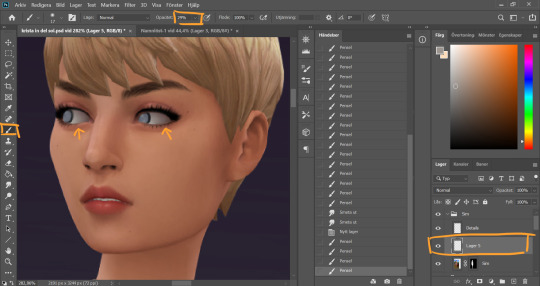
I realized I wanted the eye whites to be even whiter, so I added a new layer inbetween the Sim layer and the Details layer. Using a soft brush with lower opacity (29%) I go over the eye whites. The lower opacity allows me to build up the color by going over multiple times, creating a better blend. I then merge this new layer with the Details layer because there’s no reason for having these on separate layers going forward.
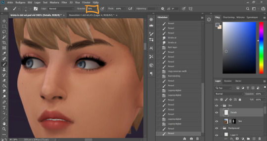
I turn the opacity of the brush tool back up and continue to draw the eyes. At this point they're looking rather creepy...
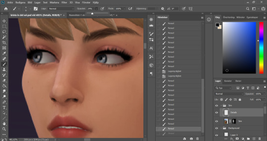
But looking much better after some added dots of “shine” with a white color (not full on white, slightly muddier)
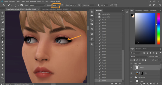
I turn down the opacity of the brush again, take a soft brush and a dark grey color and go around the whole eye to add some shadow.
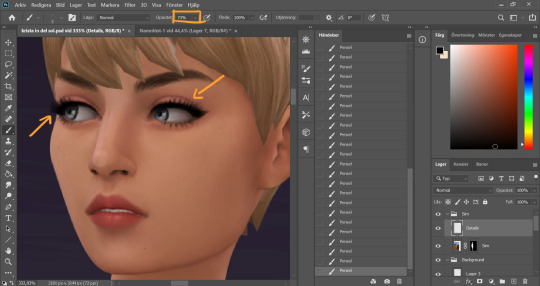
Turn up the opacity of the brush again (I know it’s a lot of back and forth with this, it’s just how I work) and work around the eyes. I clean up the make up and add some lashes. I also add some dept to the eyebrows using a slightly darker color than the existing strands and draw in some new ones here and there.
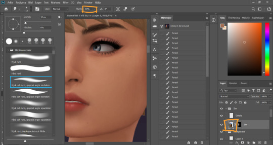
Time to clean up the nose (eeeew). I start with the Smudge tool on the sim layer, strength around 15-20%, and smudge the pixels a little.
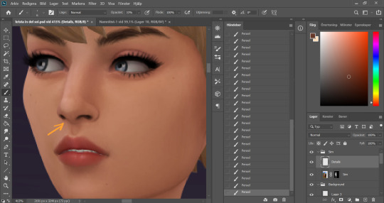
On the details layer, I clean up the nose further by drawing in the nostrils a bit, and even out the colors around and on the nose, picking up color with the eyedrop tool and going over with a low opacity brush wherever I think the color is a little uneven.
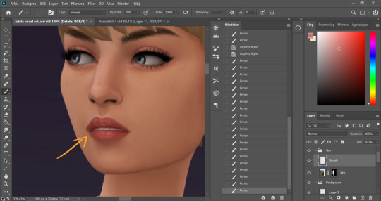
With the lips I sharpen the shape, add some highlights on the top of the lipline, clean up the corners of the mouth, redraw the teeth and add those squiggly circles on the top and bottom lip. They look a bit weird up close but zoomed out it will look glosssssy :) I pick up existing colors on the lip with the eyedrop tool and work with both lower opacity soft brushes and higher opacity hard brushes here.
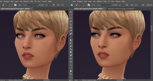
Now I feel happy with the face details. Here is a comparison of the face before and after. A little bit cleaner and smoother now!
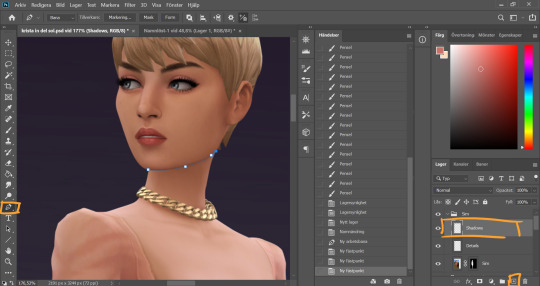
Time to throw some shade. I always start under the chin (because for some reason that's the most fun). I create a new layer in the Sim group, name it shadows, and I use the pen tool again and make a path along the jawline, sectioning off the neck from the face. I went over the basics of using the pen tool in pt 1. This is.…may be an unortodox way to do it. I'm sure a lot of people would see this as an unecessary tricky step. It is however my favorite way of doing it.
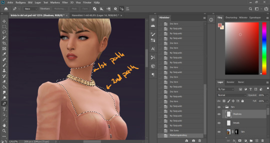
I made two paths for this first work area. Meaning I first made a full path on the neck above the necklace, closed that path and then started a new one below the necklace to include the chest area where the skin is showing (separating it from the clothes). When both my paths were closed I pressed ctrl + Enter to turn them both into selections at the same time. As you can see I didn’t bother following the “edge” of the sim, you will see why later.
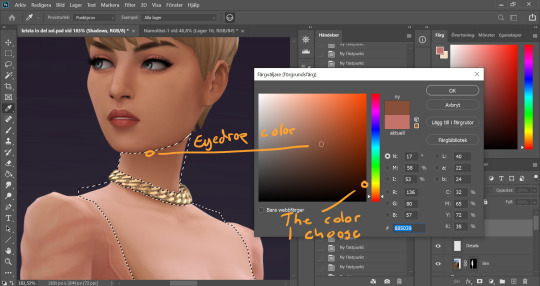
I eyedrop a color from a darker area of her skin, then I choose a darker, more saturated color in the palette that comes up.
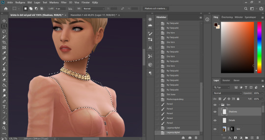
I use a big soft brush with opacity around 30%. I start to build up the shadow under the chin, with more color right under the jawline and less further out. This is where my pen tool selection comes to good use, it keeps the jawline nice and sharp even though I'm using a soft brush to get the fading effect on other parts of the shadow. As we already decided, the light comes from the left in this picture, thus the chin shadow ends up to the right. I use a smaller brush to go around the clothing line, and under the necklace. The tighter the clothes, the smaller the shadow.
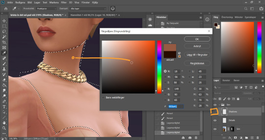
I noticed the neck was lighter on the very side of the neck, and that interferes with my shadow. Now of course I could go over with the shadow color a couple of more times in that spot, but I prefer to correct the color on the base Sim layer instead for a more even result. So I hide the shadow layer, eyedrop the slightly darker area on the neck (and keep it this time).
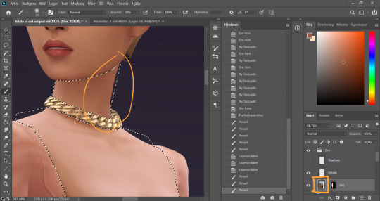
It's important to keep the selection while I do this, so I don't paint over something else. You could put this on another layer and just erase if you accidentally go over something you're not supposed to, but since I already have the selection I can just put it on the base Sim layer. I brush over the area a couple of times until the color is how I want it.
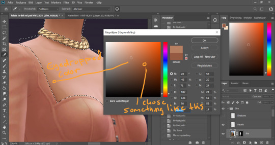
While I am at it I also thought the chest area is a little too white and colorless. This often happens on my sim pictures if I’m using a sim with lighter skin. Again I eyedrop a darker color of the skin, but this time I choose a more vibrant version of the color to avoid muckyness when I go over the white.
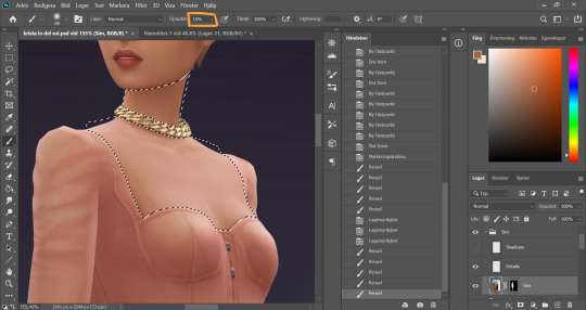
I set the opacity of the brush to super low and then very carefully go over the whiter areas of the chest a couple of times, avoiding the areas where there are details such as collarbones or cleavage.
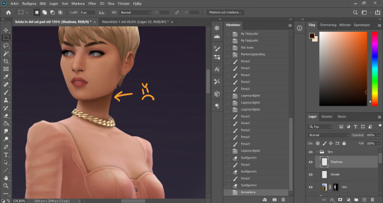
I make the Shadow layer visible again and deselect. Now you see how I have painted a little outside the skin area on the neck, because I didn’t follow the edge of the sim with my selection? I quickly fix that by holding Alt and grabbing the layer mask from the base Sim layer, and dropping it onto the Shadow layer.
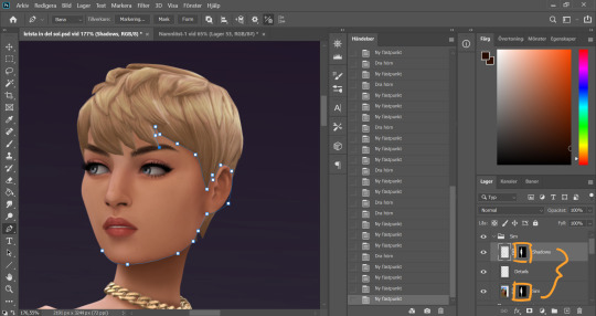
Now these two layers have the same layer mask! And it's time to bring out the pen tool again, and make a path around the face.
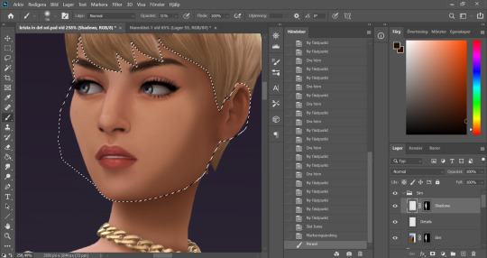
With the face selected I start painting my face shadows. I put shadow on the side of the face that´s away from our imaginary light source.
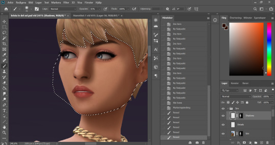
I paint shadows under any hair that covers the face, and add a shadow on the side of the nose that´s facing away from the light. This usually takes me a couple of tries to get right, like this here wasn’t it...
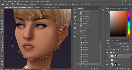
I use a 30something % opacity on my brush and then 30something % opacity on a soft eraser brush and go back and forth with these until I get a nice blend.
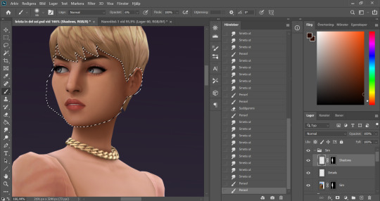
Got the nose shadow looking decent, and add a little shadow in the eye… socket?… closest to the nose. I make sure that this doesn´t go over the eye itself and interferes with any colors there. I want to keep the eyes clear.
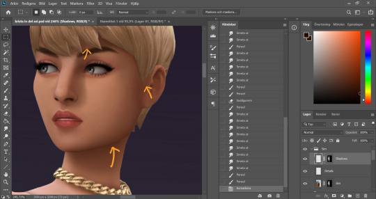
I deselect. Now we´ve got some little flaws here and there because my selection didn’t line up perfectly. I blend these with the smudge tool.
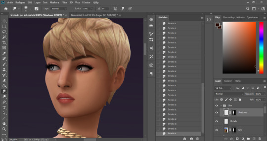
Better!
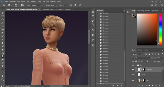
Looking fine gurl!
As I mentioned it’s a little hard to explain some steps, like the eyes and the lips, because it is just drawing until I like the result. I hope you find this useful though, and please send me an ask if you’re wondering about anything!
81 notes
·
View notes